Layer
Designing a connected banking ecosystem across mobile services and customer operations.
An internal fintech product combining everyday mobile banking, personal-finance tools and a Customer 360 platform for account, wallet and customer management.
- Role
- Product Designer
- Industry
- Fintech
- Platforms
- Mobile + Web
- Product
- Banking app + Customer 360 platform
- Scope
- UX/UI, design system, mobile banking, operational interfaces and continuous product delivery
- Collaboration
- Business Analyst, engineering, CTO and CEO
One banking ecosystem, two very different users.
The product had to make everyday banking simple for customers while giving internal teams enough operational depth to understand accounts, activity, risk, products and support needs.
The challenge was to maintain clarity and consistency across two very different interface environments: a compact mobile experience designed around quick actions, and a dense desktop platform designed around customer and financial operations.
- Accounts
- Cards
- Payments
- Transfers
- Savings
- Insights
- Products and services
Same financial logic, different interface densities.
- Customer 360
- KYC and risk
- Requests
- Accounts and wallets
- Transactions
- Activity
- Operational actions
Everyday banking organized around clear actions.
The mobile product brought balances, accounts, cards, payments and services into a compact interface designed around frequent customer tasks.
Balance & availability
Making available funds and account identity immediately visible.
Quick actions
Send, Pay and Top up positioned around common banking tasks.
Transaction context
Recent operations remain visible without deep navigation.
Card control
Freeze, replace, cancel, limits and account relationships remain accessible.
Product access
Customers can discover and manage additional financial services.
Beyond everyday banking
The home experience also combined balance information and frequent banking actions with exchange rates, market indicators, financial content and contextual shortcuts.
- Balance
- Available funds
- Upcoming payments
- Send, Pay and Top up
- Exchange rates
- Market indicators
- Financial content
- Assistant access
Turning financial data into understandable decisions.
The product extended beyond transactions by helping customers understand upcoming payments, spending patterns, saving progress and small everyday contributions.
Small contribution features still need clear financial context.
Roundups sits with savings because the product explains a contribution mechanism as part of a broader financial-wellbeing story.
Financial information designed for a mobile viewport.
Period filters, bar charts, selected data points, progress views and recurring-payment lists were organized directly inside the financial-wellbeing flows.
Touch-friendly controls
Filters and primary actions remain reachable without shrinking the financial content.
Selected data points
Charts reveal the current point in context rather than presenting decoration.
Balance hierarchy
Totals, periods and transaction details use consistent priority.
Exploring a more conversational banking experience.
The product explored an assistant-led experience for answering financial questions, surfacing budget information and guiding customers toward relevant actions.
A conversational layer for financial guidance.
The concept focused on text and voice input, contextual prompts and responses connected to balances, spending and budget information.
Bringing the complete customer relationship into one operational view.
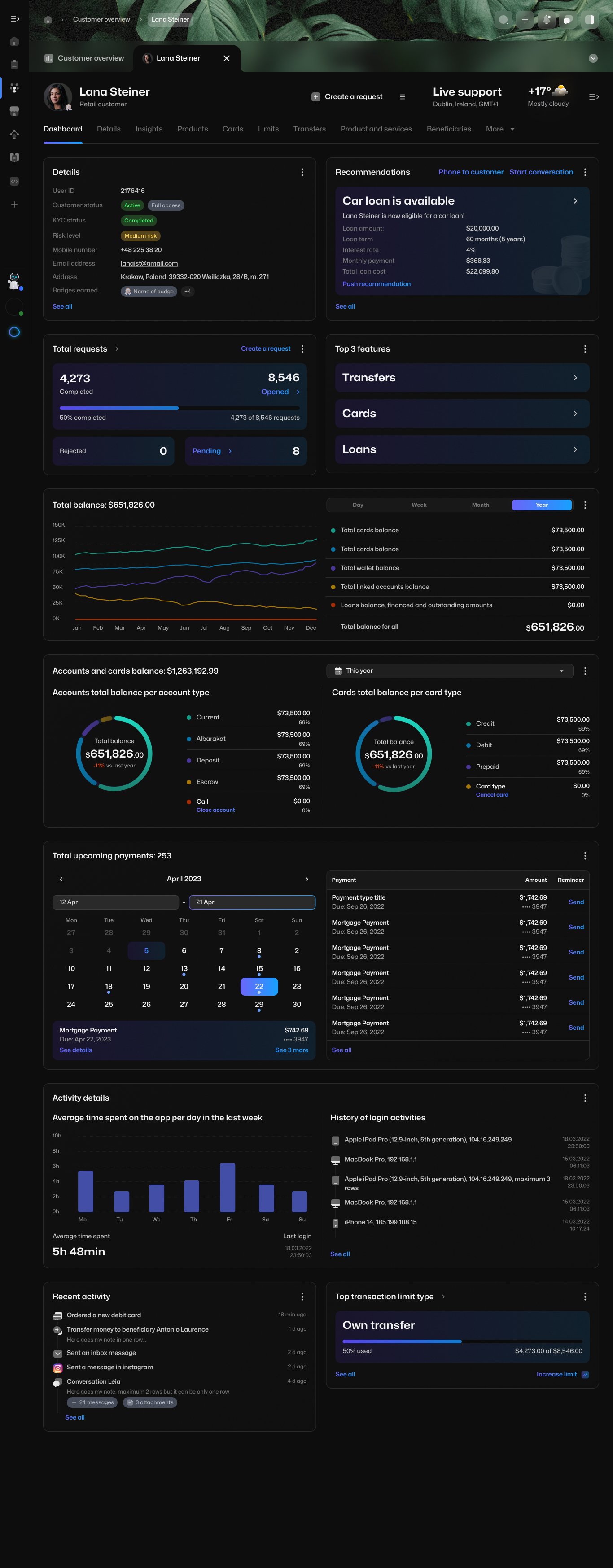
The desktop platform consolidated customer identity, account status, risk, requests, balances, products, activity and service opportunities into a single operational workspace.
Managing complex financial records without losing context.
The operational product had to support dense financial information, multiple account states and contextual actions while keeping the customer relationship visible.
Contextual actions
Pay, Transfer, Fund account and account actions stay attached to the expanded account.
Expanded row
Details appear beneath the selected account instead of forcing a separate page.
Account status
State labels remain visible while actions are available.
Balance hierarchy
Available and current balance stay prominent on the right.
Making dense banking interfaces scannable and actionable.
Progressive disclosure
Connected to the expanded account row that reveals details only when needed.
Visible status
Active, dormant, deleted and closed labels remain readable in list context.
Contextual actions
Pay, Transfer, Fund account and account actions appear where operators use them.
Financial hierarchy
Available balance, current balance and transaction amount keep consistent priority.
Filtering and search
Wallet transaction controls keep large records manageable.
One design language across mobile banking and operational products.
The design system had to support two very different interface densities: a customer-facing mobile application focused on clarity and speed, and a desktop operational platform focused on data, status and action.
Typography · Color · Spacing · Icons · Elevation
Mobile Patterns
- Account cards
- Transaction lists
- Quick actions
- Charts
- Product cards
- Bottom navigation
Shared Product Logic
- Product states
- Content rules
- Financial hierarchy
- Reusable interactions
- Status logic
Desktop Patterns
- Data tables
- Expandable rows
- Filters
- Status labels
- Dashboard modules
- Operational actions
Product States
Active, dormant, closed, deleted, pending, completed, empty and error states.
Data Visualization
Balance charts, progress indicators, calendar states, trends and transaction summaries.
The system created consistency across customer-facing simplicity and operational complexity, while giving the team reusable patterns for continued product development.
Foundation
Maintaining shared visual and interaction rules.
Product patterns
Creating reusable mobile and desktop components.
State coverage
Defining behaviour across financial and operational states.
Content, data and delivery support covered changing values, long identifiers, currencies, statuses, dense records, clear specifications and direct work with developers.
Weekly decisions within a small cross-functional team.
Layer's small team created a direct working process between business analysis, product design, engineering and company leadership.
Business analysis, design, engineering and leadership moved through the same weekly decision rhythm.
- 01
Requirements
Product requirements and sprint priorities.
- 02
User flows
Business analysis and user-flow structure.
- 03
UX/UI design
Interface structure, interaction behaviour and detailed states.
- 04
Engineering review
Feasibility and implementation clarity with developers.
- 05
CTO and CEO review
Direct product review and decision-making.
- 06
Weekly delivery
Progress and decisions presented through weekly cycles.
- 07
Refinement
Feedback, implementation support and next-cycle updates.
- 01
Requirements
Product requirements and sprint priorities.
- 02
User flows
Business analysis and user-flow structure.
- 03
UX/UI design
Interface structure, interaction behaviour and detailed states.
- 04
Engineering review
Feasibility and implementation clarity with developers.
- 05
CTO and CEO review
Direct product review and decision-making.
- 06
Weekly delivery
Progress and decisions presented through weekly cycles.
- 07
Refinement
Feedback, implementation support and next-cycle updates.
- Repeat through the next weekly cycle
My role across both sides of the product.
The work stayed within product design: interface structure, interaction patterns, design-system coverage, detailed states, developer collaboration and weekly delivery support.
Mobile product
- Banking UX/UI
- Account and card management
- Payments and services
- Financial insights
- Conversational guidance concepts
Operational product
- Customer 360
- Accounts and wallets
- Transaction interfaces
- Data-heavy dashboards
- Operational actions and states
Systems and delivery
- Cross-platform design system
- Reusable patterns
- Weekly design deliveries
- Engineering collaboration
- CTO and CEO reviews
A coherent foundation across customer banking and internal operations.
The work created a consistent product language across mobile banking and desktop operations, helping complex financial information and actions remain understandable across different users and interface densities.
Clarity
Financial information organised through understandable hierarchy and action.
Consistency
Shared patterns across mobile and desktop product surfaces.
Operational depth
Interfaces capable of supporting complex customer, account and transaction workflows.
Simple banking experiences depend on well-structured complexity.
Layer demonstrated how the same product language can support two very different needs: fast, understandable banking for customers and dense, actionable information for internal teams.
Need a clear product experience across complex financial systems?
I help teams structure financial journeys, scalable interface systems and data-heavy digital products across mobile and web.