E-commerce
Clarity around integrations, carriers, automation and tracking.
A logistics and technology ecosystem communicated through product websites, digital campaigns, 2D motion content and physical materials for partners, events and local activations.
Alfred24 combined a digital shipping platform, a physical delivery and pickup-point network, and smart-locker technology. The design challenge was to communicate that mixed ecosystem clearly without presenting each service as an unrelated offer.
Alfred24 ecosystem
Software, delivery infrastructure and physical access points presented as one connected offer.
The communication system had to speak to different audiences at once: e-commerce businesses, merchants, pickup-point partners, logistics partners, final customers, event visitors and local businesses. Each audience needed a clear entry point while still recognizing the same Alfred24 ecosystem.
Clarity around integrations, carriers, automation and tracking.
Pickup operations, local-network value and earning potential.
Delivery, access, returns and convenience explained without friction.
Fast visual communication for physical environments and commercial conversations.
The website work translated logistics software, delivery infrastructure, smart lockers and company storytelling into a set of connected product pages with a consistent visual rhythm.

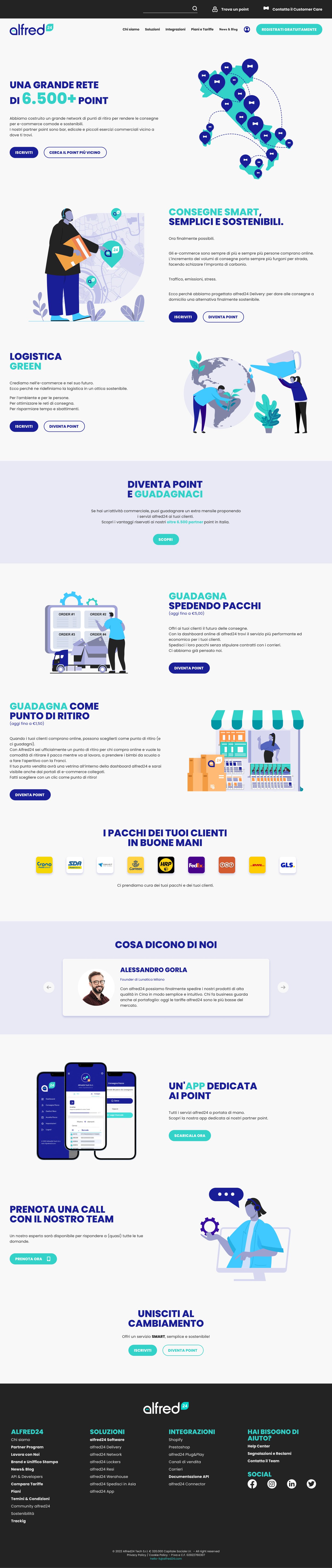

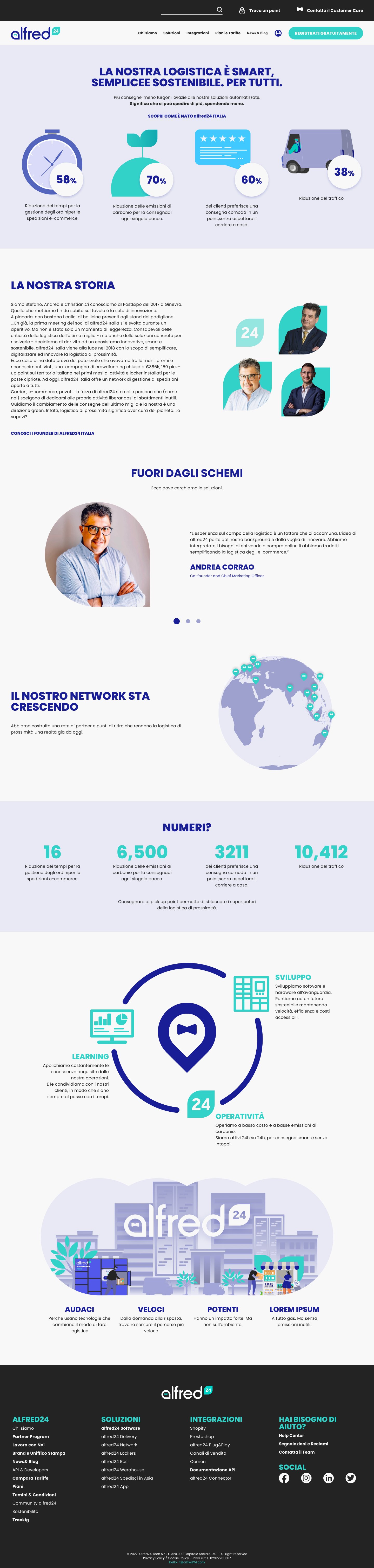
The work used a modular visual communication system rather than isolated campaign graphics. Color, typography, illustrations, rounded forms, proof points and icon patterns helped connect web pages, motion pieces, social materials and printed collateral.
Illustrations made the logistics ecosystem easier to explain: vehicles, lockers, maps, packages, partners and customer scenarios could be recombined across website sections, campaign visuals and physical materials.
Motion extended the same brand language into lightweight animated explainers and loops. The goal was not decoration; it was to make software, delivery, lockers and service relationships easier to understand.
Click to load video
Feature motion piece with normal controls and audio available after user interaction.
Loading motion loop
Silent ambient carousel loop for motion-system examples.
Loading motion loop
Muted wide-format ambient loop for product communication.
Animations were used to clarify delivery flows, product benefits and connected service relationships.
Characters, vehicles, shapes and icons could move across video, page and campaign contexts.
The same visual grammar connected static pages, loops and longer explanatory motion pieces.
The same visual system supported campaign materials, social formats, product announcements and explanatory content without starting from a blank layout every time.
Alfred24's communication did not stop at the website. Brochures, flyers, QR-code journeys, partner material and local-event assets carried the same product language into commercial and physical contexts.
The website was implemented in WordPress using reusable content structures that could support multiple product and service pages while preserving a consistent brand and communication language.
A common visual and content language across the ecosystem.
Flexible blocks for explanations, benefits, proof points, CTAs and visuals.
Landing pages adapted for shipping software, pickup points, lockers and company story.
A structure that supports ongoing publishing without redesigning every page.
The strongest value of the work was not a single page or asset. It was a reusable communication system that could move from discovery to product understanding, partner engagement, physical events and ongoing service relationships.
Website and social content
Landing pages, illustrations and motion
Campaigns, events and partner materials
Registration, partner app, product discovery and support
Ongoing communication and service relationship
My role focused on structuring the digital experience, designing product and service pages, creating visual communication assets, extending the illustration language and producing 2D motion content for the brand ecosystem.
Website design, product/service landing pages, responsive layouts, WordPress-ready content structures and page hierarchy.
Illustrations, infographics, campaign materials, social visuals, product explanations and printed assets.
2D animations, character/vehicle movement, animated explainers and reusable motion language for logistics storytelling.
The final work gave Alfred24 a clearer way to explain a complex logistics ecosystem across websites, service pages, motion assets, illustrated communication and printed materials.
Complex logistics offers became easier to explain.
Software, delivery and lockers shared one visual language.
Reusable modules supported pages, campaigns and print.
The system moved across web, video, social, events and partner communication.
Alfred24 showed how a design system can be more than interface components. When product structure, illustration, motion and physical communication share the same language, a complex offer becomes easier to understand, easier to remember and easier to extend.
The project sits between product design and brand communication: it uses UX structure to clarify services, visual systems to create recognition, and motion/print to make the same story work outside the screen.
I help companies structure digital experiences, visual systems and communication assets across web, motion and physical media.